The OCCA Website

Enabling a community to thrive through thought provoking content

A thought provoking website aimed at a wide range of audiences, designed to encourage conversation.
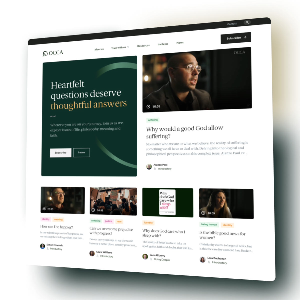
Enabling a community to thrive through thought provoking content

Background

OCCA The Oxford Centre for Christian Apologetics was first established in 2004 to help Christians engage with the deep questions of life and faith. It became a fully independent charity in February 2021. As part of the relaunch, the charity approached Rareloop to develop a new website that would allow them to hit the ground running, with scope to scale over time.

Challenge

OCCA wanted a completely new digital experience that would engage new audiences and serve their existing supporters well. They needed an easy CMS system that would allow them to self manage their content keeping it fresh and exciting. The new site needed to be accessible to all, adhering to WCAG standards, and easy to navigate across a range of devices.

OCCA’s audiences are broad, catering to people with and without a faith and also across the full academic spectrum. A content structure was therefore needed that pulled in curious new comers whilst also allowing people at different points in their faith journey to access the content that was relevant and pitched at the appropriate level based on the audience.

They wanted to engage people in conversation, serve the local church and model good debate. They also needed to showcase their full offering, including events, courses and speakers. And ultimately, they needed a way that supporters could easily donate should they wish to do so, either in a one off capacity or on a regular monthly basis.

The design needed to look clean and inviting, appealing to a wide audience, whilst also conveying credibility.

Solution

Firstly, we conducted an in-depth discovery phase, meeting with key stakeholders of the project and ascertaining what they needed to achieve with the new site. We looked at the aesthetic direction they would like to take, the core messaging of the site and how they wanted to guide users towards relevant content or actions.

Co-design discovery phase

Working collaboratively with the OCCA team, we set up an InVision Freehand online whiteboard to share ideas and feedback. This allowed us to explore options and make quick decisions whilst also enabling us to feel connected even when circumstances meant we couldn’t physically meet. Everyone, regardless of location, could then have an easy way to provide valuable input.

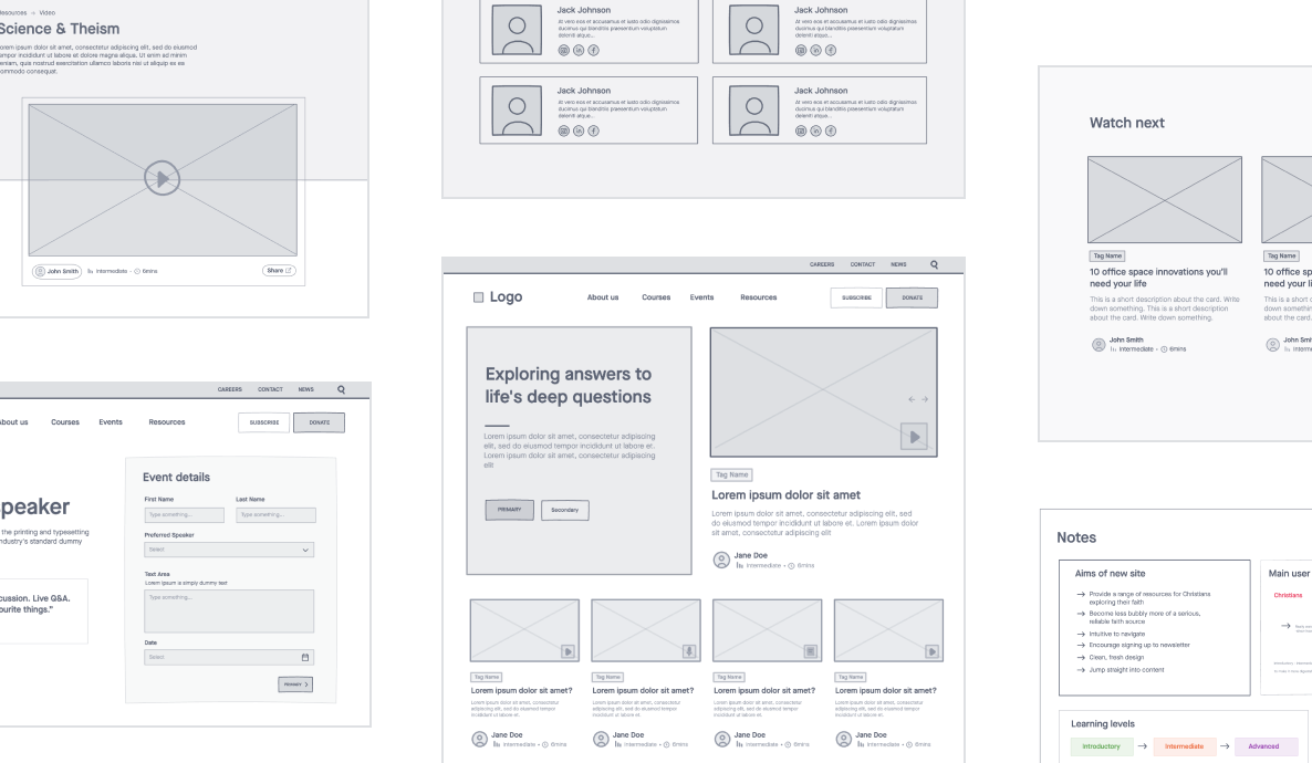
The first step in this process was to create the site map and information architecture. A key content area for OCCA was their Big Questions section. Through this they could introduce people to a challenging subject and then through links to wider reading, books, podcasts, videos and blog posts enable a much deeper dive.

OCCA Wireframing

Content Tagging

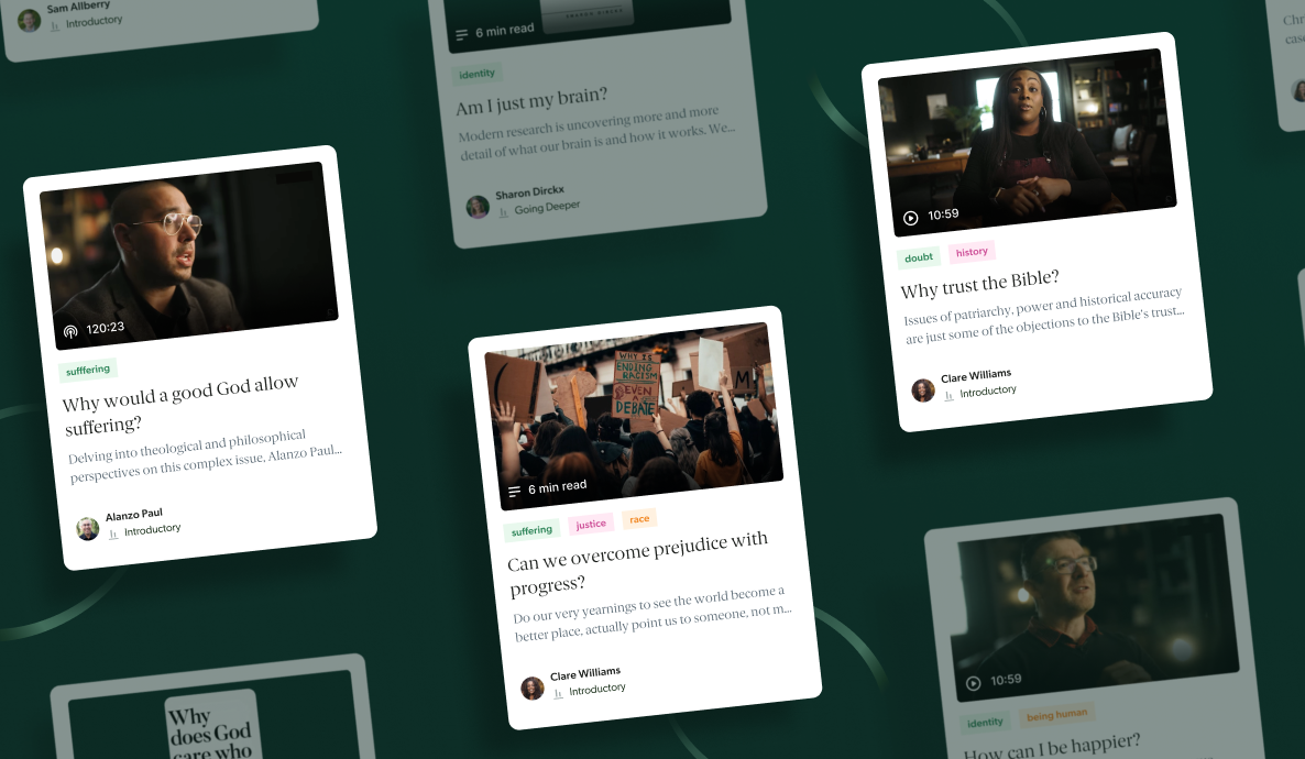
We enabled OCCA to tag all of their content with a variety of meta fields. All teasers to various article types displayed the author, length of time it would take to watch/read/listen and whether the subject matter was at an introductory or deeper level. These tags could then be used to filter to help find similar content, for example all content created by a particular author or on a particular theme.

OCCA cards

Integrated Donation Journey

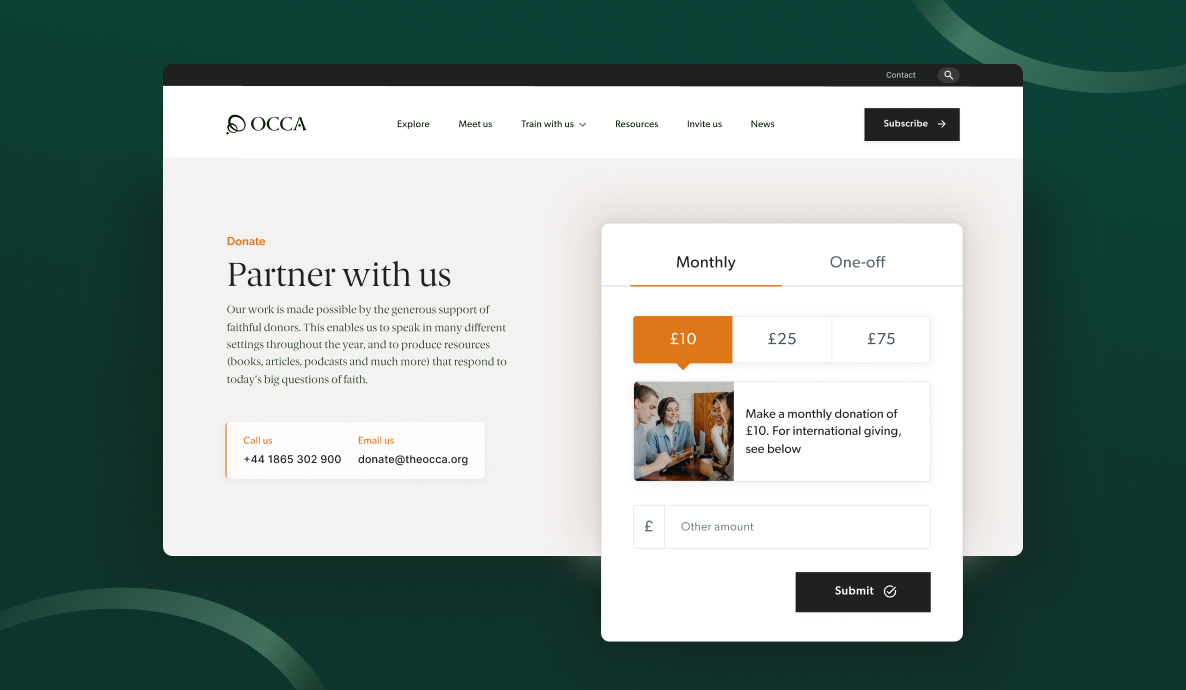
Fundraising is a critical user journey for any charity. For OCCA we created a customisable on-site donation widget that integrates with Stripe in order to collect both regular and one off donations. Supporters can now select their donation level (with the help of giving handles), make a card payment and opt-in/out of Gift Aid without ever having to leave the OCCA website.

Understanding that a one-off donation is a different commitment to a monthly one, the donation widget is designed to give OCCA full flexibility. Site admins can update the donation values, imagery and calls to action for each donation type to increase conversions and allow people to choose what they wish to support. The journey beyond the widget was carefully designed to remove distractions and increase the number of supporters completing the full donation journey.

OCCA Integrated Donation Journey

WordPress CMS and page builder

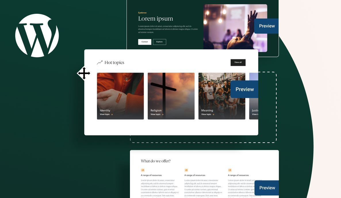
OCCA knew that the launch content for the website was just the start. They needed a powerful, flexible, and easy to use CMS that would align with their ambitious content strategy. The right CMS would ensure that users were engaged and returned to the website. To do this, we built the site in WordPress, using a comprehensive page builder. The page builder provides the team with a library of reusable components and customisable options. This gives non-technical content editors the flexibility to add and change pages using any combination of components, whilst maintaining brand consistency across the site. Pages can be built to suit their content and then easily changed as the content grows and evolves.

5 benefits of a WordPress Page Builder

The top five benefits of introducing a Page Builder into your WordPress website. Including the best approach for flexibility & performance

We also implemented a powerful and flexible form system for data capture, using Gravity Forms.

OCCA WordPress Page Builder

Results

Since the launch of the new website, OCCA have received very positive feedback and engagement from their internal team, peers and supporters.

Stakeholders love the friendliness of the website – both in terms of its welcoming feel and easy navigation. They have seen increased online donations, a surge of newsletter sign ups and high engagement with the content pages.

We continue to partner with OCCA on their digital journey, supporting them with agile sprints to release new functionality and continuously improve their website. The next phase will be to integrate with their CRM.

Andrea Ressell @ OCCA

The team at Rareloop have been incredible throughout the website project. The brief was a difficult one, with tight deadlines and numerous unforeseen changes, but we always felt like we were in safe hands. The level of professionalism, flexibility and attention to detail was excellent. It was an absolute pleasure to work with Rareloop.

Andrea Ressell, Digital Communications Manager
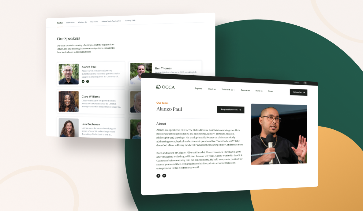
OCCA Team
Let's create something awesome together